Views
- Curriculum Graph View
- Academic Plans over Time
- Additional GE Units
- Changes to Prerequisites
- Tree of Blocked Courses
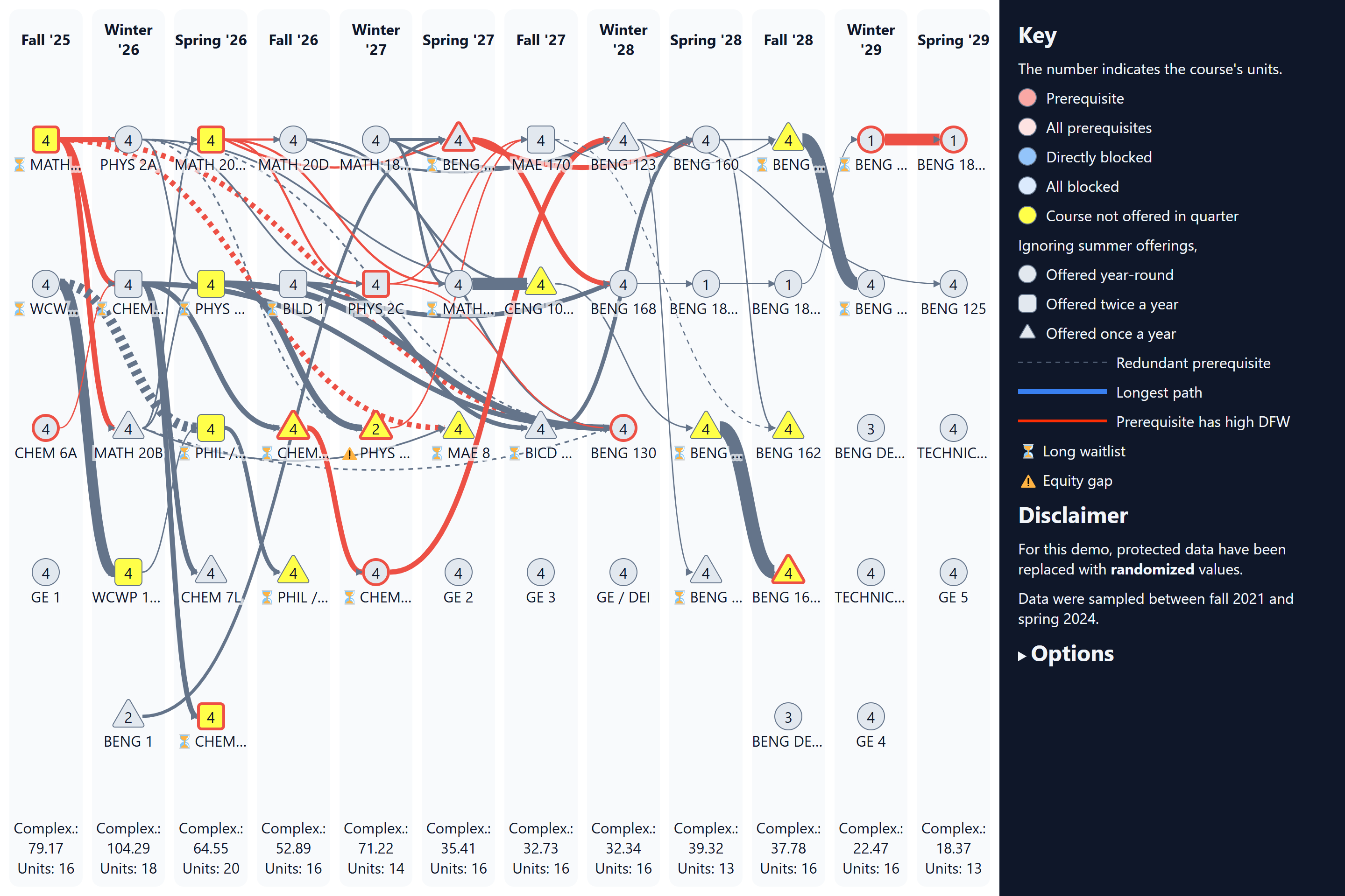
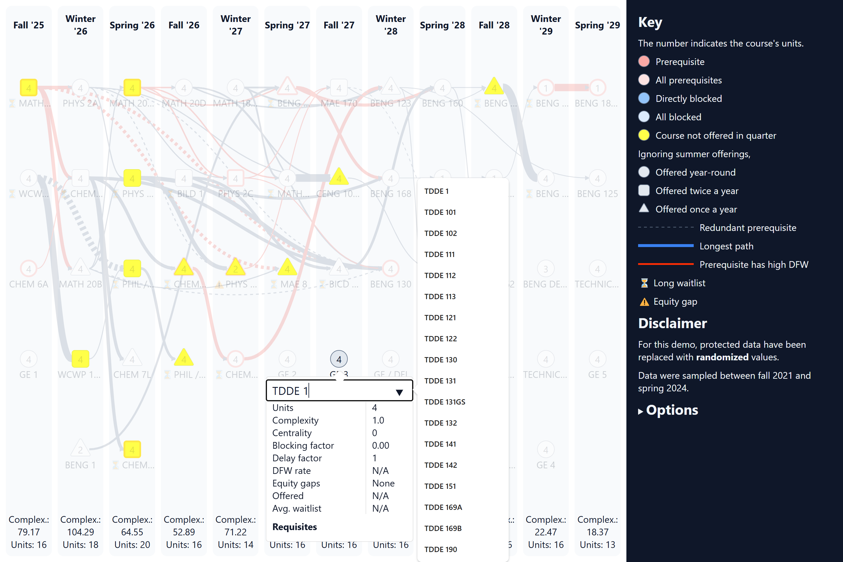
This is a custom-built tool for visualizing curricula as graphs. Each node represents a course, and lines link courses to their prerequisites. Clicking on a course opens a window listing more information about the course, such as DFW rates, average waitlist lengths, and equity gaps.
The design is based on Curricular Analytics, but with a plethora of additional features to highlight potential challenges and issues in major plans, such as:
The options panel allows for customizing whether or not these issues are highlighted and how various metrics are shown.
Many major plans use generic elective names, such as "TECHNICAL ELECTIVE," which lack prerequisite and DFW data. These courses can be substituted with a specific course code by selecting the course, then clicking and editing the course name at the top of the window that appears.


Because the visualization involves protected data, there are two versions: a public-facing demo with fake data, and a version with protected data for UCSD affiliates only.
Open to the public to showcase the features of the visualization. All data are randomized, so the graph looks artificially busier. Click on "Options" in the sidebar to adjust the amount of information shown.
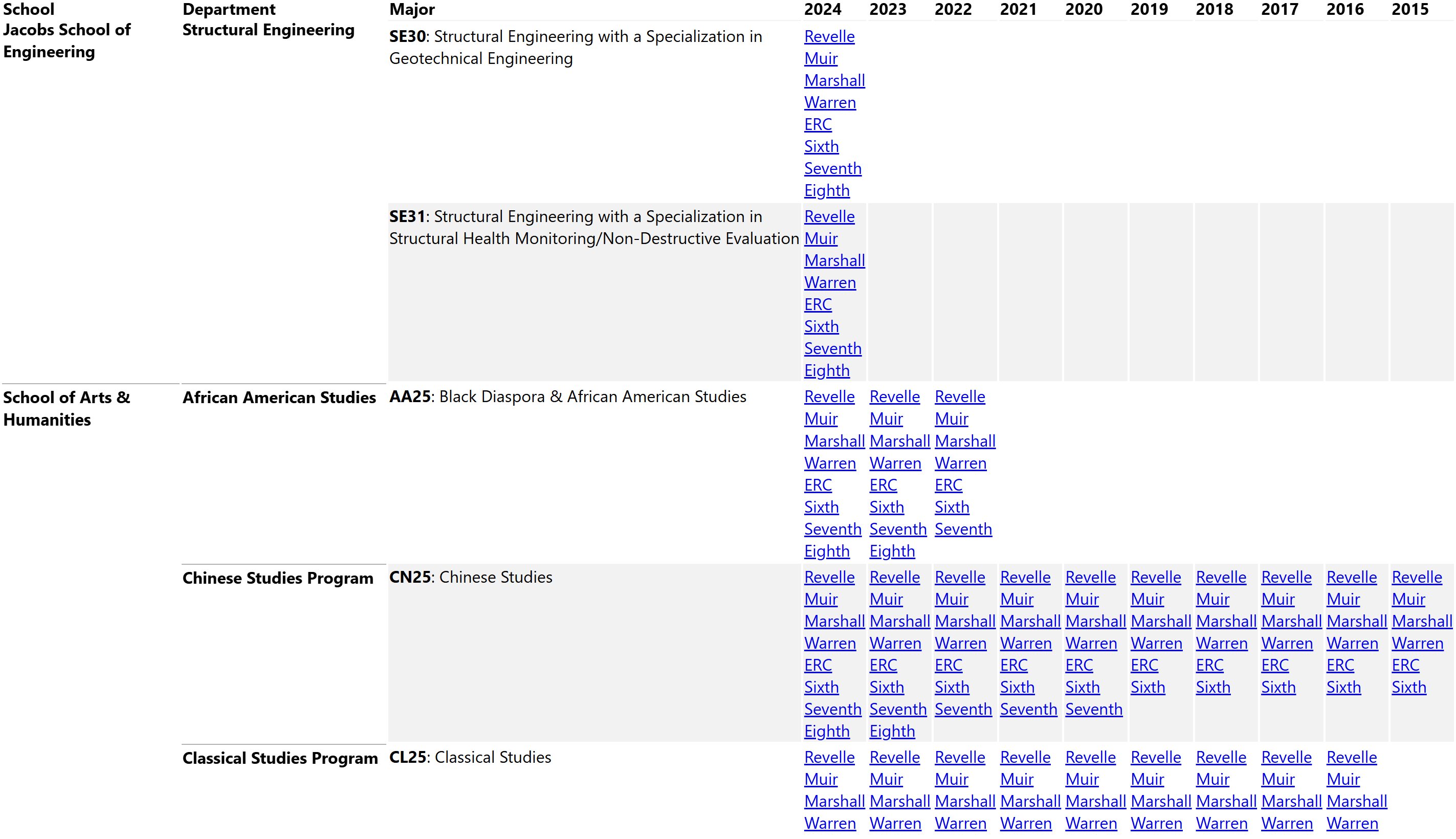
A directory listing links to graphs for every college and major for every year after 2015. These graphs use real, protected data, so access is locked to users on UCSD WiFi networks or the UCSD VPN. The academic plans were pulled from plans.ucsd.edu.

Last updated August 2025.